16 Trendy Paint Colors I’m Loving for a Fresh Home
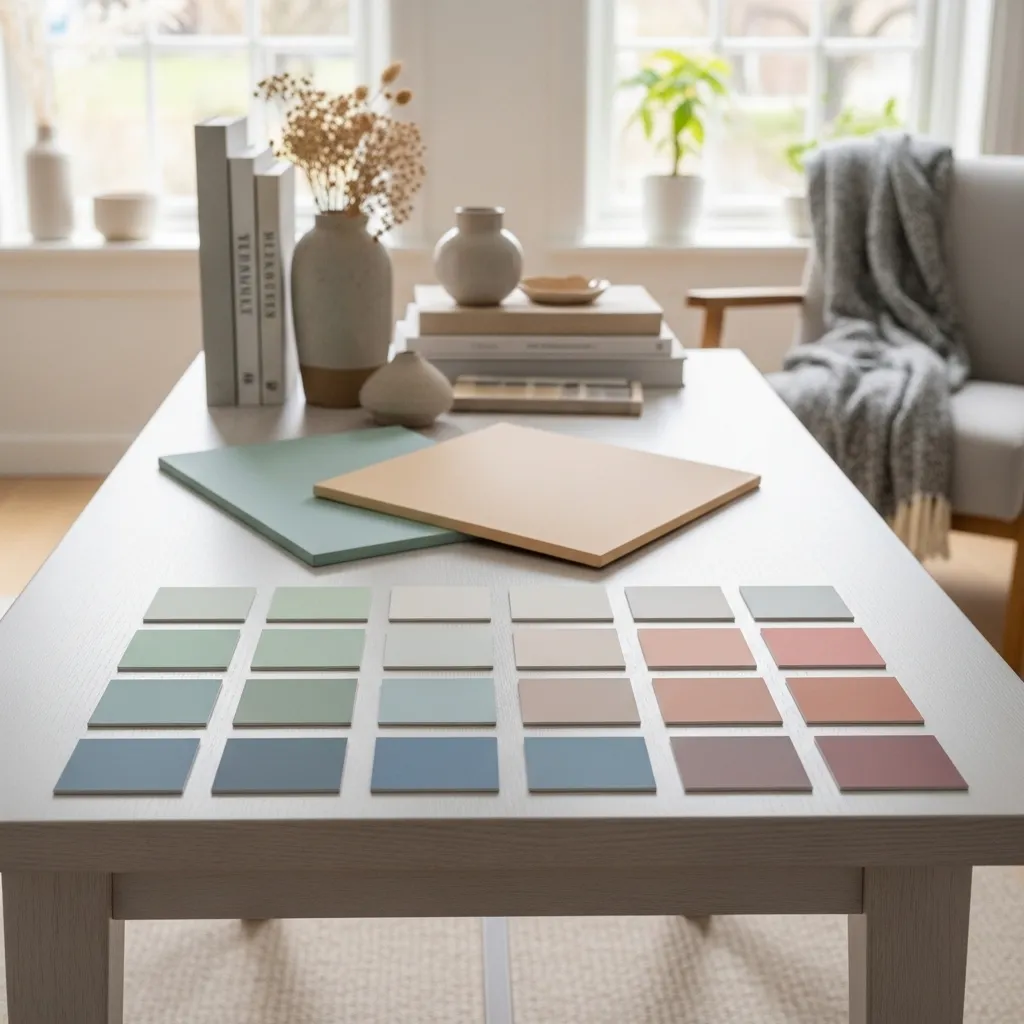
Choosing a paint color can feel overwhelming. I’ve been there, staring at a wall of swatches, paralyzed by possibility. But it’s also one of the most powerful and affordable ways to transform your space. The right hue can change the entire mood of a room, making it feel cozy, energized, serene, or sophisticated.
I’ve been keeping a close eye on the trends, not just what’s fleeting, but the colors that feel right for how we live now. We’re craving comfort, connection to nature, and spaces that spark joy. This list is my curated collection of 16 trendy paint colors, from the bold and dramatic to the soft and soothing, that I would personally use in my own home. Let’s find your next favorite.
1. Evergreen Fog (SW 9130)
This is the sophisticated neutral we’ve all been waiting for. Sherwin-Williams’ Color of the Year a while back, it’s a gorgeous, gentle gray-green that feels incredibly peaceful. It’s not too cool, not too warm—it’s just perfectly balanced.
I love it in a bedroom or home office for its calming vibe. It pairs beautifully with natural wood tones, crisp white trim, and linen textiles. It’s a color that feels both current and timeless, like a soft, misty morning.
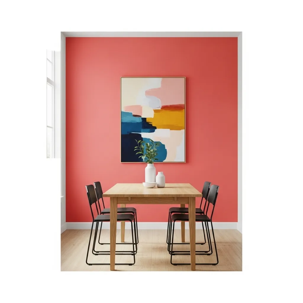
2. Raspberry Blush (BM 2003-30)
Ready for a dose of dopamine? Benjamin Moore’s Color of the Year is a confident, vibrant coral-red that’s pure joy. It’s not for the faint of heart, but it makes such a powerful statement.
I’d use it on an accent wall in a dining room, a powder room, or even the inside of a bookshelf. It looks amazing with deep blues, warm woods, and brass accents. It’s the color equivalent of a bold lipstick—it instantly lifts your mood.
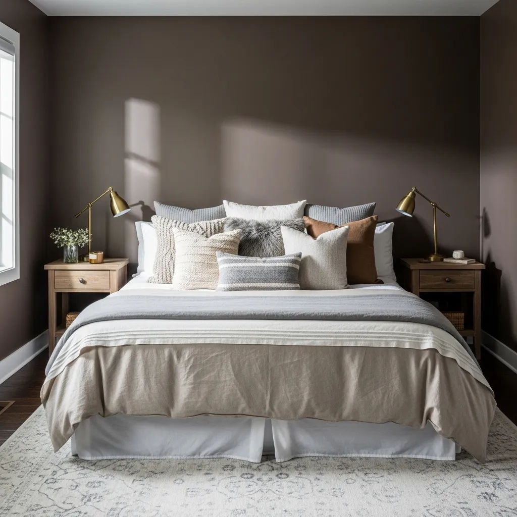
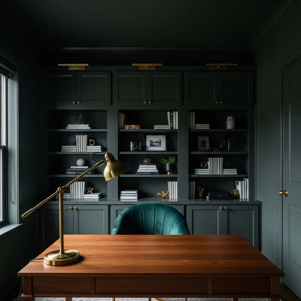
3. Urbane Bronze (SW 7048)
This is my go-to for creating instant drama and coziness. A deep, smoky bronze with gray undertones, it’s incredibly rich and enveloping. It makes a room feel intimate and anchored.
Try it in a study, a bedroom accent wall, or on kitchen cabinets for a high-end look. I love it with creamy whites, leather, and textured baskets. It’s a dark color that feels surprisingly warm and welcoming.
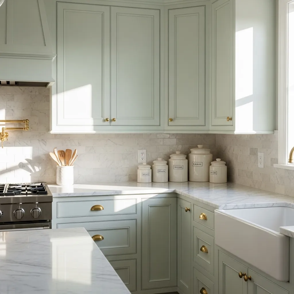
4. Whispering Spring (BM 2144-60)
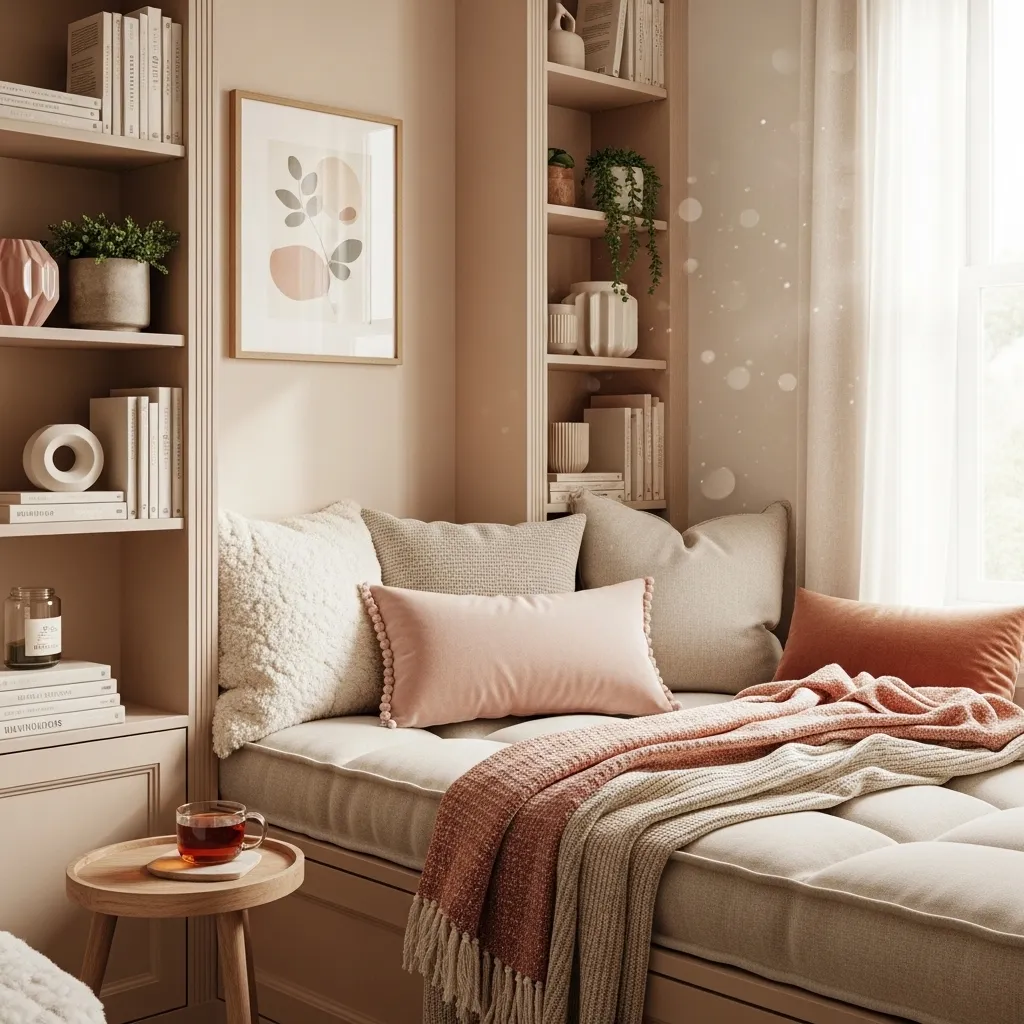
If you love a light, airy feel but find plain white too stark, this is your color. It’s the palest, most delicate hint of green, like the first buds on a spring tree. It adds a whisper of color without overwhelming.
It’s perfect for north-facing rooms that need a lift, or for creating a serene backdrop throughout an entire home. Pair it with other soft pastels or lots of natural light for a truly ethereal look.
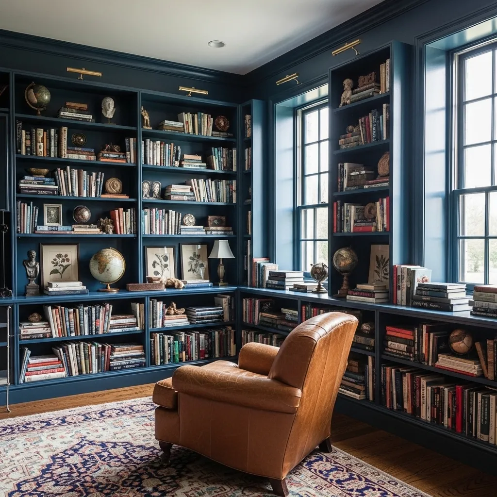
5. Hague Blue (F&B No. 30)
A classic for a reason. This Farrow & Ball favorite is a deep, inky blue with a touch of green. It feels both traditional and utterly modern. It has incredible depth and looks different in every light.
I adore it in a library, a dining room, or on lower kitchen cabinets. It creates a sense of grandeur and pairs perfectly with glossy white trim, gold frames, and rich velvet.
6. Shoji White (SW 7042)
This is the warm white that never fails. It has soft, barely-there yellow and gray undertones that keep it from feeling sterile or cold. It’s the ultimate chameleon, looking clean and bright yet incredibly cozy.
Use it on trim, ceilings, or all over for a seamless, light-filled look. It’s my top choice when I want a neutral that lets my furniture and art take center stage.
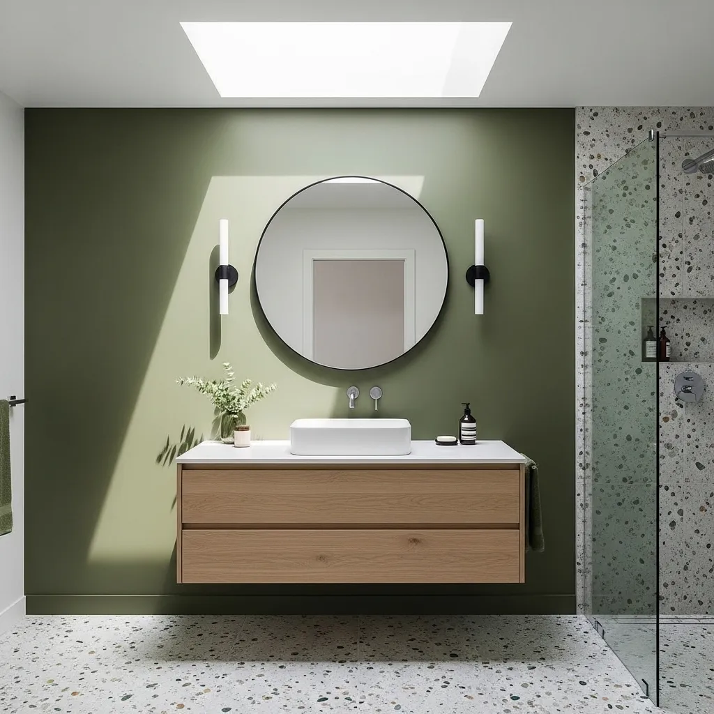
7. Ripe Olive (SW 6209)
Bring the outdoors in with this grounded, earthy green. It’s a muted, sophisticated olive that feels both rustic and refined. It reminds me of a peaceful forest.
It works wonders in sunrooms, living areas, or even a home office to promote focus. Combine it with terracotta pots, woven textures, and black metal accents for a perfectly balanced, nature-inspired palette.
8. Cracked Pepper (SW 7675)
Move over, pure black. This soft black with strong charcoal and gray undertones is much more approachable. It’s less harsh and has a beautiful, velvety quality on walls.
I love it for exterior doors, window frames, or an accent wall behind a bed. It makes a stunning contrast against bright white and looks incredibly chic with warm wood floors.
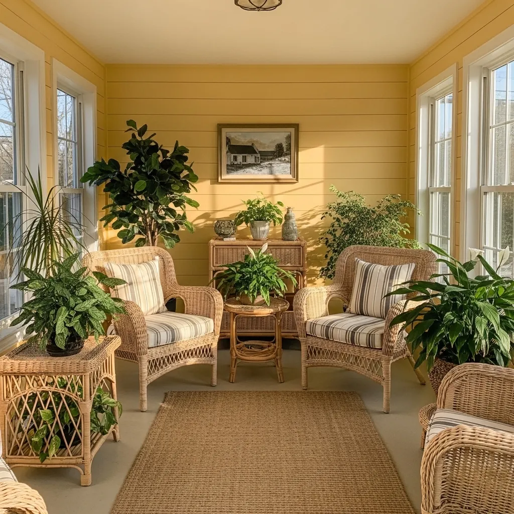
9. Sunlight (BM 2022-40)
This is pure, optimistic happiness in a can. A cheerful, buttery yellow that’s not too loud, it’s like the first ray of sunshine in the morning. It instantly warms up any space.
It’s perfect for a kitchen, a breakfast nook, or a hallway that lacks natural light. Pair it with crisp white and navy blue for a classic look, or with soft grays for a more contemporary feel.
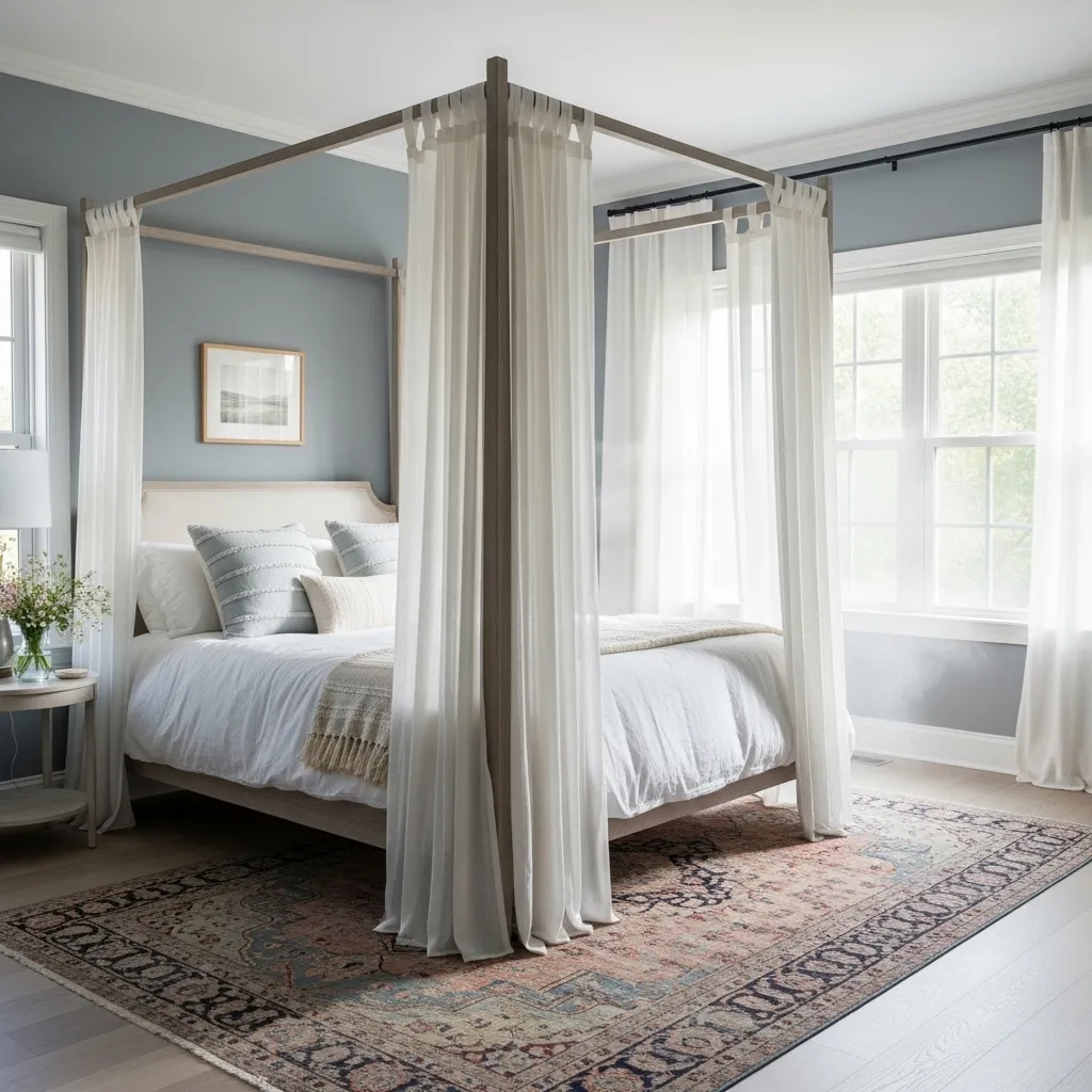
10. Misty (SW 6232)
Think of the calmest, most serene sky just before dusk. This is a beautiful, hazy blue with a touch of gray and lavender. It’s dreamy and soft, promoting total relaxation.
It’s an ideal choice for bedrooms, bathrooms, or any space meant for unwinding. I’d style it with fluffy white towels, silver accents, and pale driftwood tones.
11. Redend Point (SW 9081)
Another beautiful earthy choice, this is a blush-beige with a subtle clay-like warmth. Sherwin-Williams described it as “heartfelt,” and I agree. It feels nurturing and gentle.
It’s a fantastic whole-house color that flows beautifully from room to room. It looks amazing with textured walls (like limewash) and complements both modern and rustic decor seamlessly.
12. Charleston Green (BM HC-124)
This is the darkest, most dramatic color on my list. It’s so deep it almost reads as black, but in the light, you see its rich green undertones. It’s historic, elegant, and full of personality.
Use it for extreme contrast on interior doors, built-in cabinetry, or a powder room for a unforgettable moment. It’s luxurious paired with polished nickel and marble.
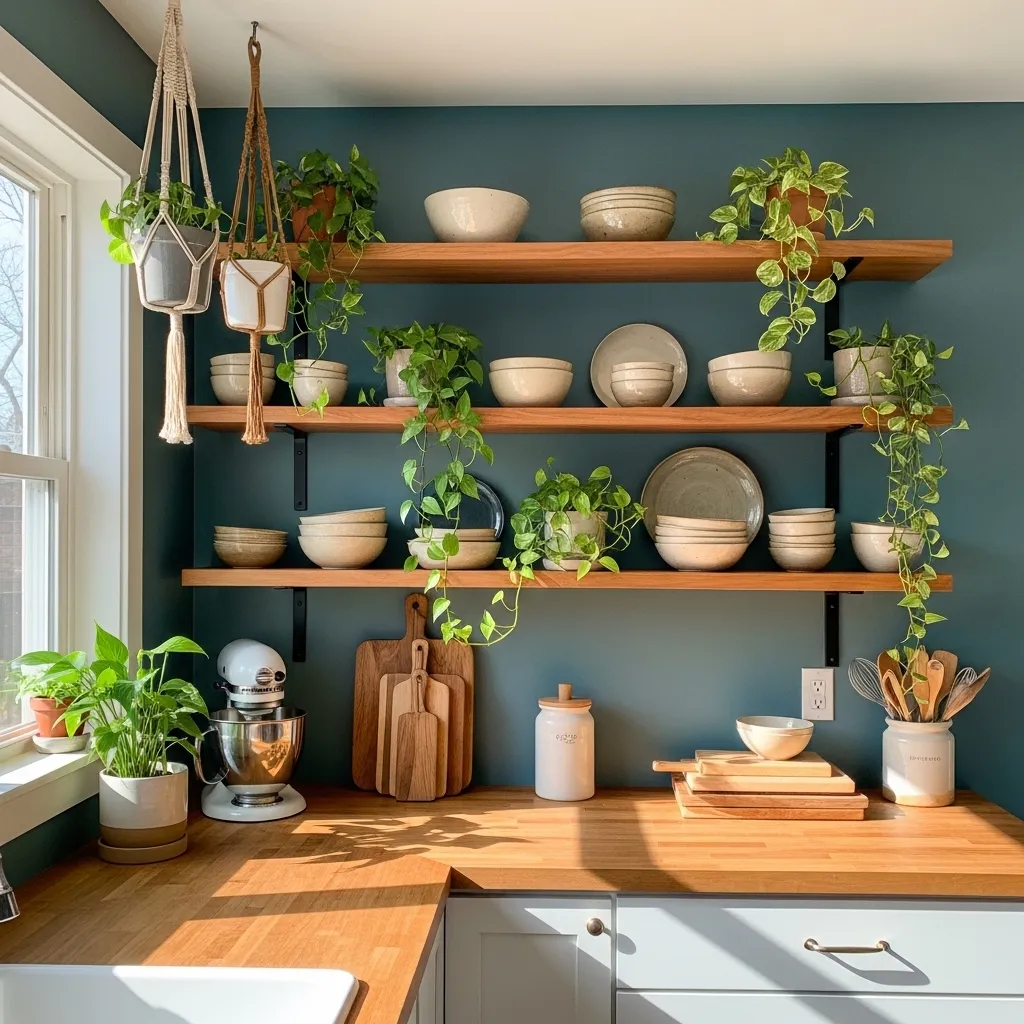
13. Aegean Teal (BM 2136-40)
A balanced blue-green that feels both nostalgic and fresh. It has a wonderful mid-tone depth that’s inviting rather than overwhelming. It reminds me of vintage pottery and coastal vacations.
This color shines in a living room or kitchen. Try it on lower cabinets with white uppers, or on walls with warm walnut furniture. It’s incredibly versatile and friendly.
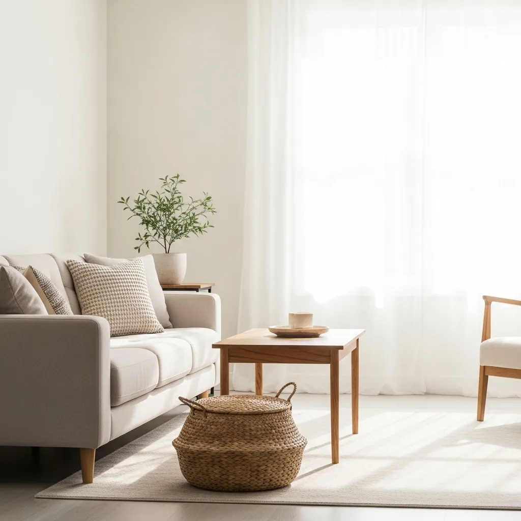
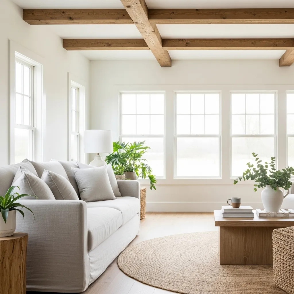
14. Alabaster (SW 7008)
My absolute favorite warm white. It’s a soft, creamy white that always looks clean and bright but never clinical. It has a timeless, welcoming quality that works in any architectural style.
I use it on trim, walls, and ceilings for a cohesive, bright look. It’s the perfect backdrop for both bold and neutral decor, letting you change your style without repainting.
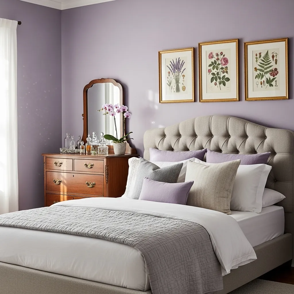
15. Dusty Lavender (SW 6261)
Lavender gets a grown-up makeover. This version is grayed-out and muted, losing any childish purple vibe. It’s soft, romantic, and incredibly chic.
It creates a lovely, soothing atmosphere in a bedroom or sitting area. Pair it with charcoal grays, dark greens, and natural rattan for a look that’s far from expected.
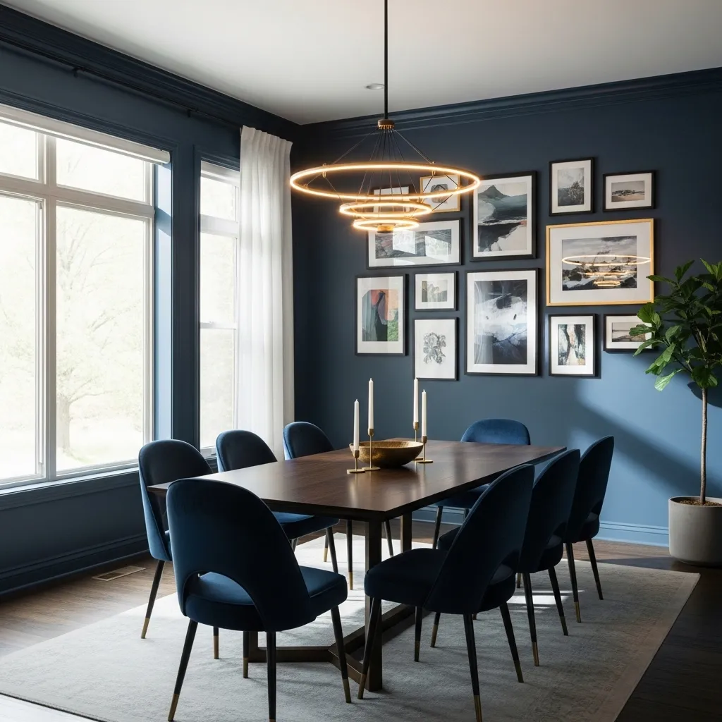
16. Naval (SW 6244)
A timeless navy that’s deep and resonant. It’s a classic for good reason—it’s powerful, grounding, and works in almost any room. It feels both nautical and scholarly.
I love it in a dining room for intimate dinners, on a front door for great curb appeal, or in a home office to aid concentration. It looks fantastic with crisp white, mustard yellow, and brass hardware.
Final Thoughts
The best trend is the one that makes you feel at home. While these 16 colors are all on-trend, the most important thing is how a color makes *you* feel in your space. Always, always test a large swatch on your wall and observe it at different times of day before committing. Don’t be afraid to go bold in a small space or embrace soothing neutrals everywhere. Your home is your canvas—paint it with colors that tell your story.
Your Paint Color Questions, Answered
Q: How do I choose between warm and cool tones?
A: Look at the fixed elements in your room (flooring, countertops, cabinets). Do they have yellow/red (warm) or blue/gray (cool) undertones? Choose a paint color with similar undertones for harmony. Also, consider the room’s light—north-facing light is cooler, south-facing is warmer.
Q: Should I paint the ceiling the same color as the walls?
A: For a cozy, intimate feel or in a room with low ceilings, painting the ceiling the same color (or a slightly lighter shade) can be beautiful. For a sense of height and airiness, a bright white ceiling is usually best.
Q: How many paint colors should I use in my home?
A: There’s no rule! Many designers use a flowing palette of 3-5 colors to create cohesion from room to room. You might have one main color, a lighter version, a darker accent, and a neutral. Too many disparate colors can feel chaotic.
Q: Are dark colors a bad idea for small rooms?
A> Not at all! A dark, rich color can make a small room feel cozy, intentional, and dramatic—like a jewel box. It can actually make the boundaries of the room recede. The key is good, layered lighting.
Q: What’s the biggest mistake people make when choosing paint?
A: Skipping the sample! Paint looks completely different on a tiny chip, in a big swatch, and on all four walls. Buy a sample pot, paint a 2×2 foot area, and live with it for a couple of days. It’s the best $6 you’ll spend on your project.